unequal representations
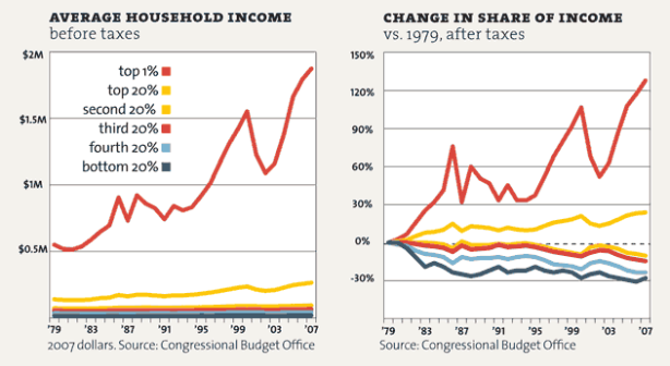
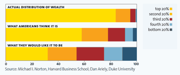
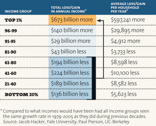
graphic representations of inequality, in the United States and around the world. . .
> I use to assemble a presentation on inequality on a regular basis for my Principles of Microeconomics course (when, before my department was dissolved, I was permitted to teach it—and won a university teaching award for doing so). Here are links to the latest one, from Fall 2010, as a pdf document, a Powerpoint presentation, and a Quicktime movie.
> Folks who found my inequality presentations useful (which I haven’t updated since 2010) can now turn to the Powerpoint presentation recently assembled by Jared Bernstein and Ben Spielberg.
> Here are links to posts about inequality on this blog.
> The following are some other representations of inequality (please feel free to send me additional ones):
source [pdf]
source [pdf]
source [pdf]
source [pdf]
source [pdf]
source [pdf]


[…] unequal representations ← Murder in the coal fields […]
[…] מעביר קורס על הגידול באי השיוויון בארה"ב ומציג באתר שלו כל מיני אינפוגרפיקות מעניינות בנושא . לפעמים גרף אחד […]
David,
This is an amazing resource. I’ll make sure my comrades and mates Down Under see it.
Thanks for making it available.
Marco (The Magpie)
[…] on economics, politics, and society (most recently, here and here), and he maintains a page on unequal representations which is a collection of graphic representations of inequality. This is especially important today, […]
Thanks, David. This is information that must be presented again and again. I’m re-posting it to my friends and students. One problem we face, however, is getting it circulating outside the circle of those who already know. In any case, this post is a great service, as it collects a lot of important data into one place and presents it in easily comprehensible forms.
Dear Peter, I’m glad you find the information useful. I’ve just updated the presentation I use in my Principles of Microeconomics course, which is now available from links at the top of the page in 3 formats: pdf, Powerpoint, and Quicktime.
[…] Homeaboutcrisis representationsunequal representations […]
[…] Ruccio posted an excellent series of charts on inequality (pdf, ppt, and mov links at the top). For […]
[…] Dame econ professor David Ruccio has put together a fantastic presentation for his macroeconomics course (via @interfluidity) regarding wealth and inequality in the US, and how it […]
David,
Your Bowdoin classmate Dave Larsson here. Read about this via Steve Randy Waldman a/k/a interfluidity on Twitter. Graphic, in every sense of the word.
Cheers,
Dave Larsson
Assemblies of credible charts like this are invaluable with students. Most are more interested in ‘pictures’ than in numbers, so this is a big help getting the message across, thanks. You can bet I’ll put it to good use.
Some more inequality charts you might find interesting:
http://motherjones.com/politics/2011/02/income-inequality-in-america-chart-graph
[…] Homeaboutcrisis representationsunequal representations […]
[…] Image: David Ruccio […]
[…] Image: David Ruccio […]
[…] Image: David Ruccio […]
[…] Image: David Ruccio […]
[…] Image: David Ruccio […]
[…] Image: David Ruccio […]
[…] Image: David Ruccio […]
[…] David Ruccio […]
[…] David Ruccio […]
[…] David Ruccio […]
[…] David Ruccio […]
[…] David Ruccio […]
[…] David Ruccio […]
What appears to be missing is charts indicating income mobility. From 1996 -2005, less than half of those in the top 1% remained in the top 1%. In the same time period, roughly half of tax payers in the bottom income quintile raised to a higher income quintile. Median incomes of all taxpayers increased by 24 percent after adjusting for inflation. The real incomes of two-thirds of all taxpayers increased over this period. In addition, the median incomes of those initially in the lower income groups increased more than the median incomes of those initially in the higher income groups. These statistics were very comparable to a similar study covering 1986-1995. (source: United States Department of the Treasury Income Mobility Study)
And what’s missing from your account, G, are two things: First, income mobility in the United States is decreasing and is less than in many other advanced capitalist countries (witness the kerfuffle concerning the Great Gatsby curve). Second, if there is income mobility (within and/or between generations), it is still the case that it’s mobility between highly unequal income groups. In other words, the existence of mobility doesn’t eliminate the problem of inequality or of classes.
Prof. Ruccio,
There is also one issue with the Income Mobility Study. To be fair, I suppose this limitation is inevitable and inherent to data originating from tax returns: taxpayers tend to evade taxes by understating their incomes.
This, for instance, is openly acknowledged by The World Top Incomes Database, that also works with taxation data (see here: http://g-mond.parisschoolofeconomics.eu/topincomes/#Introduction).
(Incidentally, the Income Mobility Study does not warn against this, although they do mention that the 2005 figures are incomplete, in the Technical Appendix, starting in page 18).
Further, not all taxpayers are equally capable (or indeed have the same incentive) to evade taxes. The World Top Incomes Database, for instance, warns that higher income earners have more incentives and means to provide underestimates of their incomes.
All of this means that the inequality figures obtained should be considered as conservative estimates. Therefore, measures of mobility could overestimate actual mobility: the real upper cutoff point for one quintile, for example, could be considerably higher than the figure estimated from the tax returns.
In other words: even if a taxpayer’s income increased in the measure estimated, the increase could be insufficient to take this taxpayer to the following quintile.
[…] David Ruccio […]
I’d love to see updated charts.
Me, too. If only I had more time. Sorry. . .
David
[…] David Ruccio […]
The site has been disabled for violating terms of service. But nothing really dies on The Ineternet.
https://web.archive.org/web/20131231132644/http://jowebereconomist.wordpress.com
[…] David Ruccio […]
[…] unequal representations […]
[…] unequal representations […]
[…] David Ruccio […]